



This is how our new company logo was born
Redesigning a logo takes time, thought and even a bit of hesitation.
It means a radical change to a familiar element, one we see every day and have grown attached to. But everything is constantly changing and, sometimes, the old has to make way for the new.
In a company that keeps growing like ours, it matters to convey an image that represents us and evolves with us. In this article we tell you how we arrived at the new Cutlite Penta logo.
The old Cutlite Penta logo
The old logo gave more prominence to the company name and featured a 3D geometric shape recalling a laser beam at its center, followed by the claim laser processing solution. A rather text-heavy logo, perhaps too redundant, that needed a refresh.
The new Cutlite Penta logo
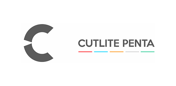
The new logo has, first of all, a flat approach, in line with current graphic design trends: a cleaner result, with fewer frills. Only the C remains at the center, not the whole name. The C has a cut on its left side that recalls the laser beam: still the emblem of our work. Closing it off is the Cutlite Penta name, present but less prominent than before.
Why? We always want to put the work and the commitment to our customers first, without being overly self-referential. The result is a logo that reflects the growth and evolution of our company.
Frequently asked questions
Why did Cutlite Penta change its logo?
Because in a growing company the image has to grow with it: the previous logo no longer reflected what we had become.
What does the C in the new logo stand for?
The C carries a cut on its left side that recalls the laser beam: the mark of the craft inside the mark of the brand.
What style is the new logo?
A flat design, essential and readable at any size, from the machine to print to screen.
What did the old logo look like?
It gave more weight to the company name and had a three-dimensional geometric shape at its center.
Discover what a Cutlite Penta fiber laser can do for your production
Tell us about your work: we'll help you find the laser system best suited to your thicknesses, volumes and goals.
